
Custom templates allow you to extend or modify tooltips/popover/sidebar produced by the SvgPublish Visio extension to tailor your needs. This article explains how to create such custom templates.
Default tooltips (screen tip)
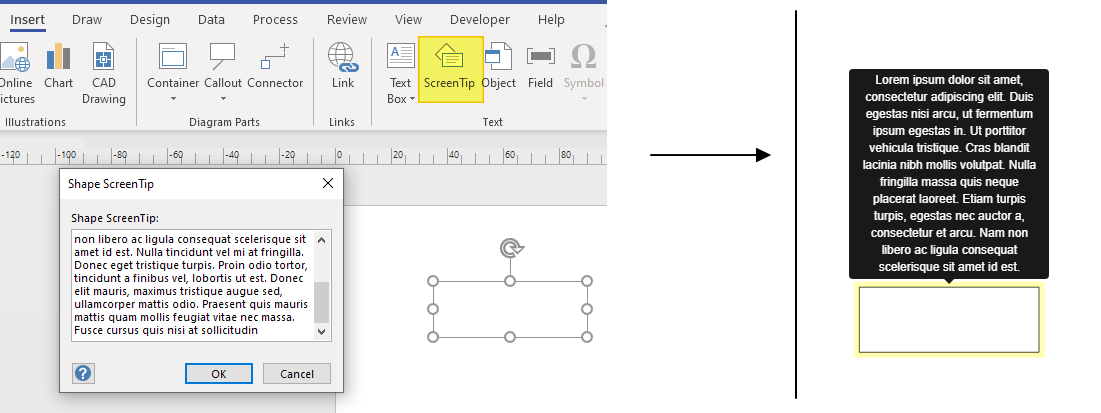
Without templates, the extension uses Visio "Comment" field for the tooltips and popovers. If you just enable tooltips in the settings (enabled by default), and have some ScreenTip set to some text (this is rendered in Visio itself as a tooltip as well). The "Popovers" use the same (comment) as content, and shape text as a title.
Templates
The templates window
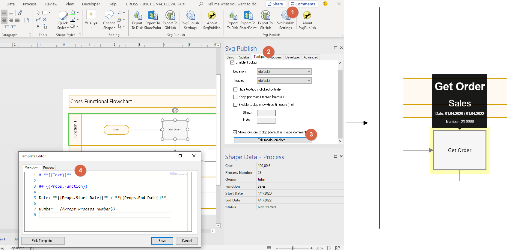
To achieve more advanced display, you can use templates. The "Edit template" button is located on the corresponding tab (i.e. for "Tooltips" on Tooltip, for the pop-over dialogs on the "Popovers", for the "Sidebar" on the "Sidebar" tab).
The templates use markdown syntax. Markdown is a simple language for formatting text. Please note that you can also use HTML tags directly in markdown. It supports images, bold/italics, headers, tables, etc.
Referencing to shape data in templates
The template applies to ALL shapes. To use data from the "current" shape for which the template is used, you can use {{...}} brackets syntax. for example, to get shape text, use {{Text}}. To get comment (screen tip), use {{Comment}}. To use properties of the shape, prefix the name of the property with 'Props.' For example, on the picture above, there is "Process Number" property in shape data. You can address this one with {{Props.Process Number}}. The property is formatted the same way it is formatted in Visio.
The property values can come from Excel or other data sources. The extension uses the values from Visio. You can use shape data also in link values, i.e. the following is legal: .
Some basic example:
# A First Level Header
## A Second Level Header
This is just a
regular paragraph.
### Header 3
# Shape properties
Property1: {{Props.Property1}}
Property2 (italics): *{{Props.Property2}}*
Property2 (bold): **{{Props.Property2}}**
image: 
Hyperlinks:
See [Markdown-Cheatsheet](https://github.com/adam-p/markdown-here/wiki/Markdown-Cheatsheet)
Popover templates
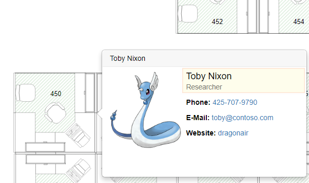
In the popover templates (popup "dialogs" on click) you customize both caption and the content. The content is the main part. They can be thought to be used as "bigger brothers" of a tooltips (you can check them on the first picture for example). You can customize the popover templates exactly the same way as for the tooltips, just from the "Popovers" tab.
Links and images in templates
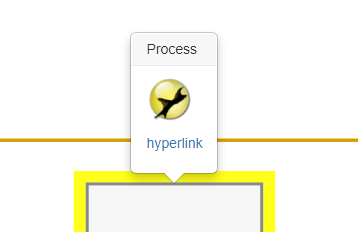
You can use either hyperlinks, or data:xxxx links in the templates. Use of the hyperlinks is pretty easy. For link you put [title](url) and for the image you put . You can make phone and email links with callto: and mailto: prefixes.
Like [call someone](callto:+12345678) or [mail me](some@one.at)
 [hyperlink](https://github.com/adam-p/markdown-here/wiki/Markdown-Cheatsheet)
If you want to use a property, you can do that with {{Props.PropertyName}} syntax.
Link with Title "Something" pointing to url set by property "LinkUrl":
[Something]({{Props.LinkUrl}})
Link with Title set by property "LinkTitle" pointing to url set by property "LinkUrl":
[{{Props.LinkTitle}}]({{Props.LinkUrl}})
The same thing configured using <a> tag:
<a href="{{Props.LinkUrl}}>{{Props.LinkUrl}}</a>"
You may want to use <a> tag in case you need extra parameters, for example to open the link in a new window:
<a target="_blank" rel="noopener noreferrer">{{Props.LinkUrl}}</a>"
Colors, size, style, and all other things
You can change colors and style (minimum for example), but this is a bit more complicated – this can be set explicitly with CSS. Means, you can add custom CSS code to the diagram that can be used to customize the tips/templates/sidebar. Here things get a bit technical. The SvgPublish uses standard bootstrap tooltips/popovers, so all the techniques you can find for those are applicable to SvgPublish as well. You can add custom css under the SvgPublish => Developer Tab:
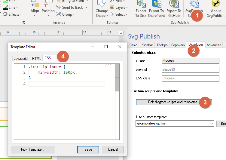
Some frequently asked examples with CSS for tooltips:
- set minimum width and change the color of a tooltip:
.tooltip-inner { min-width: 150px; background-color: green; color: white; } - set minimum size of a popover:
.popover {
    min-width:200px;
    min-height:250px;
}
Sidebar content
You can replace sidebar content completely with your own content; or you can add some content to the standard sidebar blocks (properties/links/etc). To have ONLY your content, you can enable the sidebar, and turn off everything you see there except custom content:
Conditional appearance
Sometimes you don’t want to use the same template for everything, but only for specific shapes. You can do that by conditional templates (this is supported by the substitution #condition syntax). The template engine is using Mustache logic-less templates under the cover, so all the logic expressions that can be used there (such as loops and conditions) can also be used in the templates.
For example if you want to show a tooltip only for a shape that has property "Number" filled, you could do this:
{{#Props.Number}}
    This tooltip will show up only for items where Number is set
{{/Props.Number}}
You can also define a property for a shape, say "ShowTip" and set to it some formula in Visio, so that when exported it is set only for shapes for which you want the tip to be displayed.
Examples
You can find more examples in the gallery. You can download the original Visio files there and examine the customization done there.