
Overview
The SVG Publish SharePoint Web Part is an interactive web part that allows you to display and interact with SVG diagrams exported from Microsoft Visio directly within SharePoint Online. This web part provides rich interactivity features including pan, zoom, hyperlinks, tooltips, layers, shape selection, and more.
The web part runs entirely inside your SharePoint tenant to display the diagram. It does not call, depend on, or send your data to any external services or third-party servers. This is an explicit privacy feature so your diagram content remains within your tenant.

https://appsource.microsoft.com/en-us/product/office/WA200009144
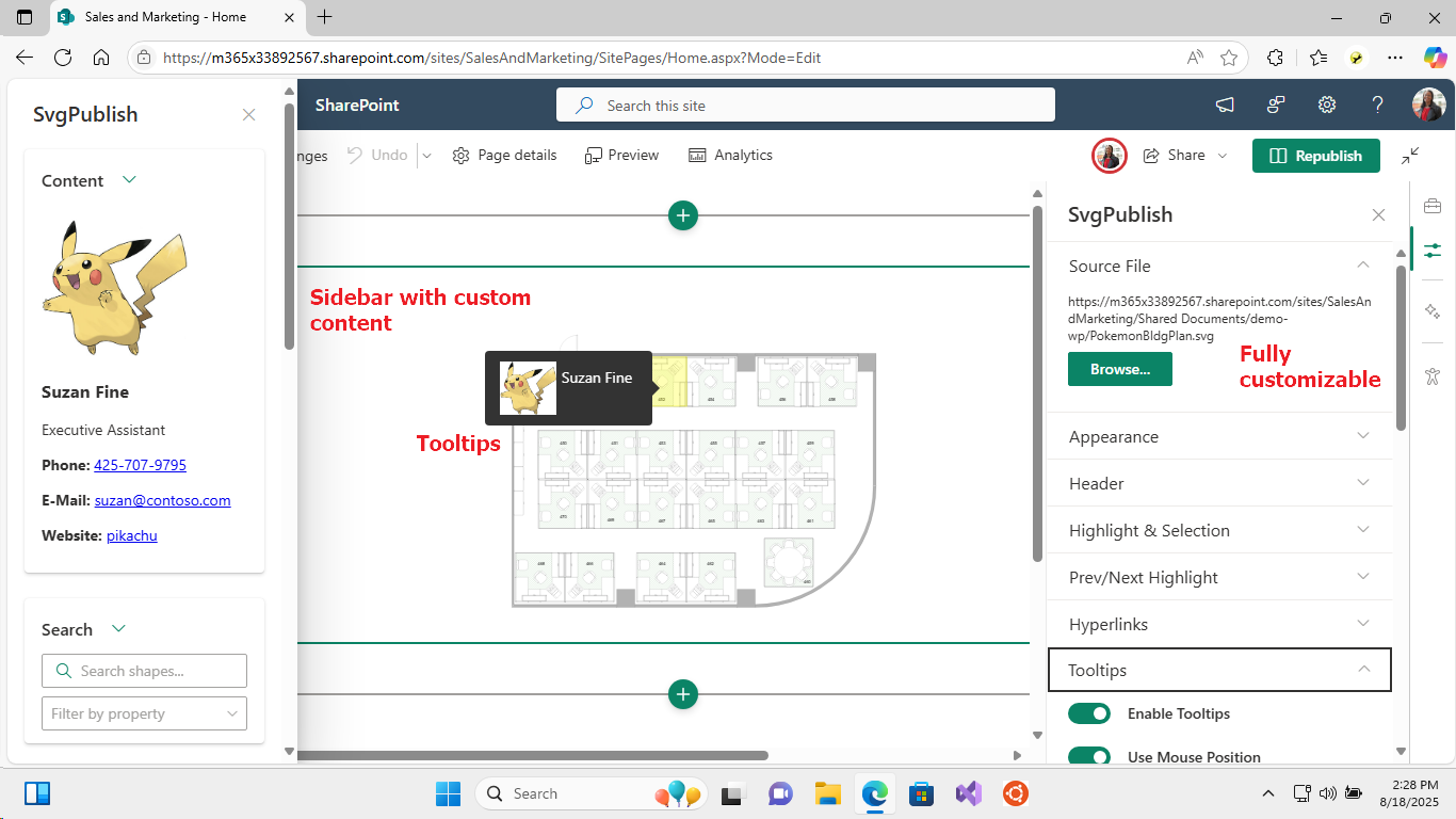
Table of Contents
Installation and Setup
Prerequisites
- SharePoint Online environment
- SVG files exported from Microsoft Visio using the SVG Publish tool
- Appropriate permissions to add web parts to SharePoint pages
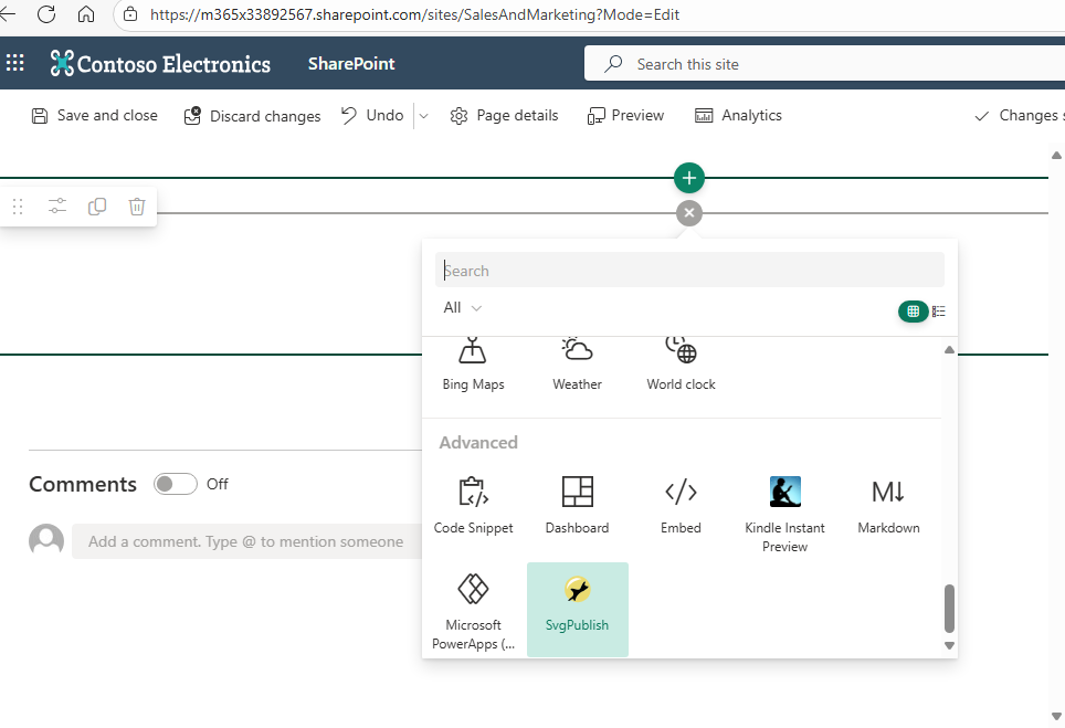
Adding the Web Part
- Edit your SharePoint page
- Click the "+" icon to add a new web part
- Search for "SVG Publish" or find it in the web part gallery
- Add the web part to your page
Basic Configuration
Essential Settings
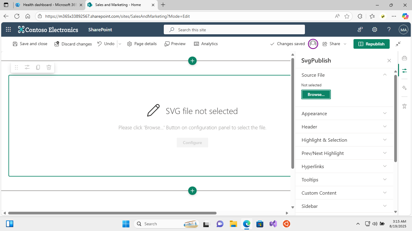
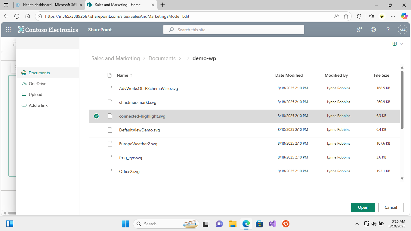
1. Source File Configuration
- SVG File: Select the SVG file exported from Visio
- Use the "Browse…" button to select from SharePoint document libraries
- Supports files stored in SharePoint Online or OneDrive for Business
- File must be accessible to users who will view the web part
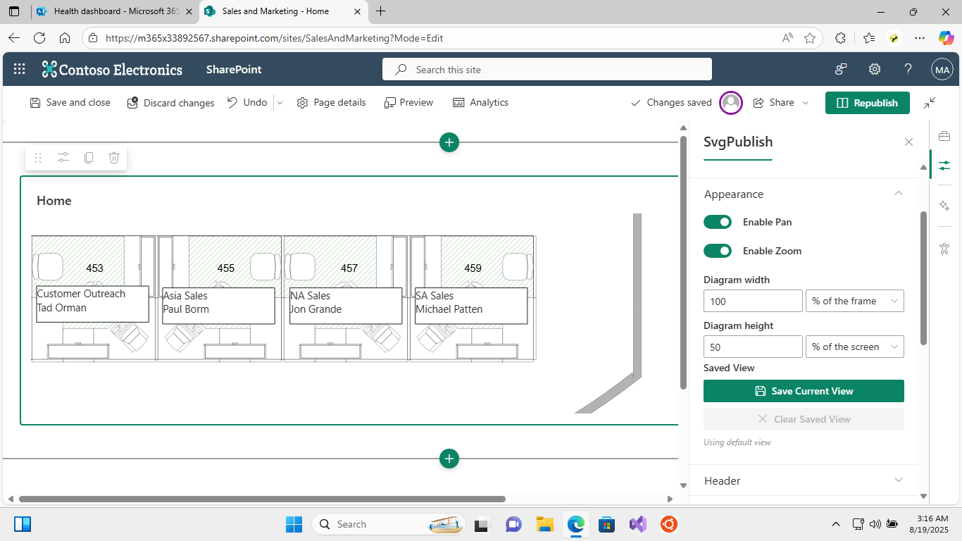
2. Display Settings
- Diagram Width: Set the width of the diagram (e.g., "800px", "100%")
- Diagram Height: Set the height of the diagram (e.g., "600px", "auto")
- Saved View: Save and restore a specific view (zoom level and position) for the diagram
- Pan & Zoom Controls: Enable/disable user interaction with the diagram
- Option to require modifier keys (Ctrl/Shift) for zoom to prevent accidental zooming
- Option to require two-finger touch gestures for better mobile experience
Property Panel Groups
The web part organizes settings into logical groups for easy configuration:
1. Source File Group
- SVG File: Select the SVG file exported from Visio using file picker
For most options to work you should select an SVG file that was published using the SVGPublish add-in. This web part is a "companion" web part for it. If you select just a random SVG file, only basic appearance options will work.
2. Appearance Group
- Enable Pan: Allow users to pan around the diagram
- Enable Zoom: Allow users to zoom in/out
- Require Ctrl key for zoom: When enabled, users must hold Ctrl while scrolling to zoom (prevents accidental zooming)
- Require Shift key for zoom: When enabled, users must hold Shift while scrolling to zoom (prevents accidental zooming)
- Require two fingers for touch gestures: When enabled, single-finger touch gestures are disabled, requiring two fingers for pan/zoom operations (better for mobile/tablet experiences)
- Diagram Width: Set the width of the diagram (e.g., "800px", "100%")
- Diagram Height: Set the height of the diagram (e.g., "600px", "auto")
3. Header Group
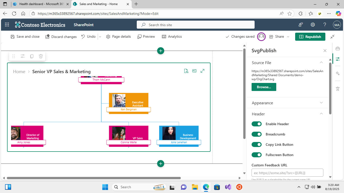
- Enable Header: Show/hide the diagram header
- Breadcrumb: Show navigation breadcrumbs for multi-page diagrams (when header enabled)
- Copy Link Button: Enable copy hash link functionality (when header enabled)
- Fullscreen Button: Enable fullscreen mode button (when header enabled)
- Custom Feedback URL: Set custom feedback URL with {{URL}} placeholder (when copy link enabled)
4. Highlight & Selection Group
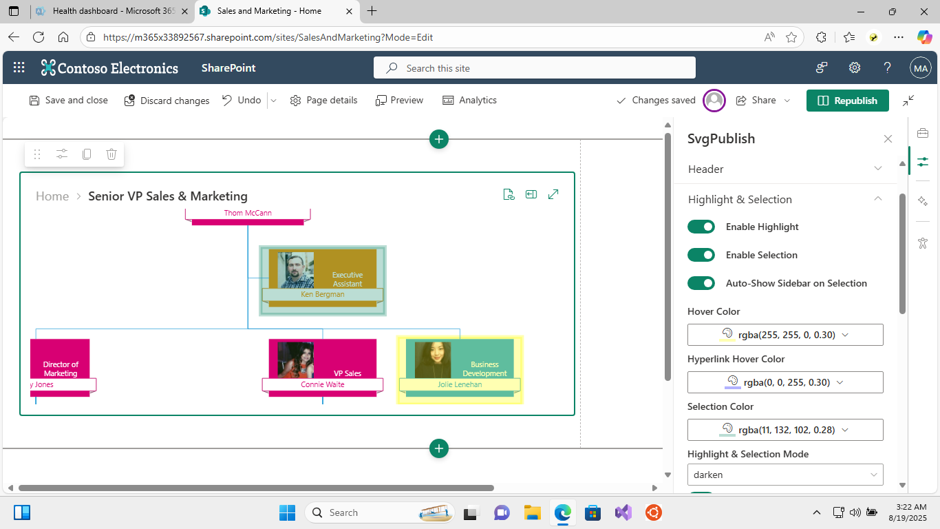
- Enable Highlight: Enable hover highlighting effects
- Enable Selection: Allow selecting shapes
- Auto-Show Sidebar on Selection: Automatically open sidebar when shapes are selected
- Hover Color: Color used when hovering over shapes
- Hyperlink Hover Color: Color used when hovering over hyperlinks
- Selection Color: Color used when shapes are selected
- Highlight & Selection Mode: How highlighting appears ("normal", "lighten", "darken")
- Enable Dilate: Enable outline dilation effect
- Dilate Size: Size of the selection outline dilation (when dilate enabled)
- Enable Blur: Enable blur effect
- Blur Amount: Amount of blur effect (when blur enabled)
- Use Box Selection: Use simple rectangle selection style
5. Previous/Next Highlight Group
Controls highlighting of connected shapes:
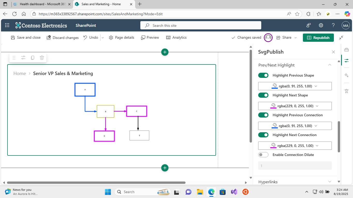
- Enable Previous/Next Shape Colors: Highlight connected shapes
- Enable Previous/Next Connection Colors: Highlight connections
- Previous Shape Color: Color for previous shapes
- Next Shape Color: Color for next shapes
- Previous Connection Color: Color for previous connections
- Next Connection Color: Color for next connections
6. Hyperlinks Group
- Enable Follow Hyperlinks: Allow clicking on hyperlinks in shapes
- Open in New Window: Control how hyperlinks open
- Rewrite Visio Hyperlinks: Convert hyperlinks to Visio files (.vsdx or .vsd) to SVG files with the same name (.svg). Can be useful when publishing a bunch of inter-linked diagrams, which is the case for many SvgPublish users.
- Rewrite Office Hyperlinks: Always use web-version for the office file links (open in the web-apps, i.e. automatically append ?web=1 if not present)
7. Tooltips Group
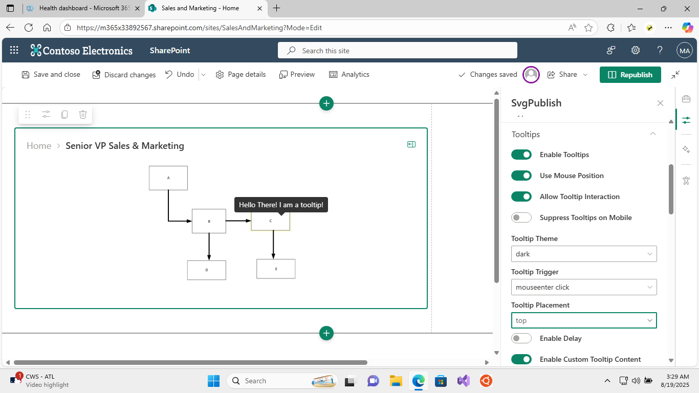
- Enable Tooltips: Show tooltips on hover or click
- Use Mouse Position: Position tooltip at mouse cursor
- Allow Tooltip Interaction: Enable interaction with tooltip content
- Suppress Tooltips on Mobile: Disable tooltips on touch devices
- Tooltip Theme: Visual style ("dark", "light", "light-border", "translucent")
- Tooltip Trigger: How to trigger tooltips ("mouseenter", "click", "mouseenter click")
- Tooltip Placement: Position relative to cursor/shape
- Enable Tooltip Delays: Enable show/hide delays
- Show/Hide Delays: Timing for tooltip appearance/disappearance
8. Custom Content Group
You can specify your content for tooltips, sidebar, or shape overlays.
The custom content can contain markdown and reference shape properties.
For the future details on templates, please refer the article below. In the web part, the custom content works exactly the same way.
https://unmanagedvisio.com/using-custom-templates-in-svgpublish/
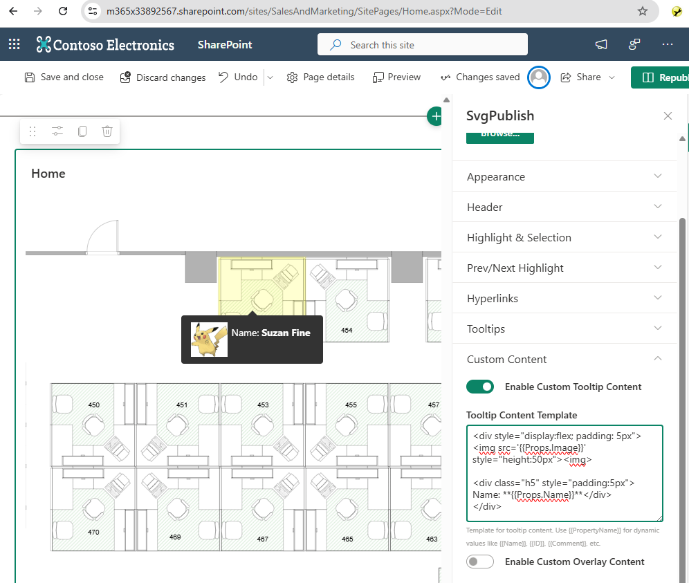
- Enable Custom Tooltip Content: Use custom Markdown content for tooltips
- Tooltip Content Template: Custom Markdown content (when enabled)
- Enable Custom Overlay Content: Add custom content with Markdown support
- Overlay Content Template: Custom Markdown content to display (when enabled)
- Enable Custom Sidebar Content: Add custom content with Markdown support
- Sidebar Content Template: Custom Markdown content to display (when enabled)
9. Sidebar Group
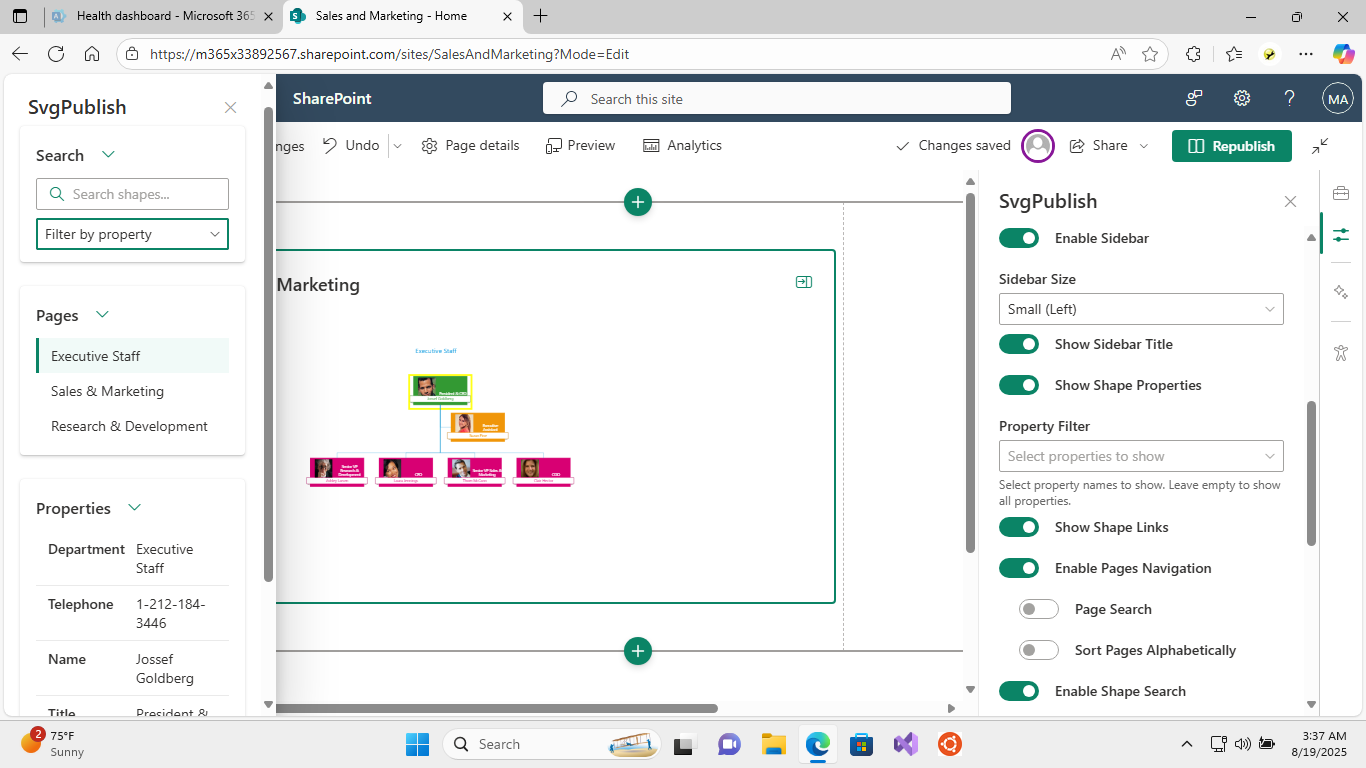
- Enable Sidebar: Show/hide the information sidebar
- Sidebar Size: Size and position options ("Small", "Medium", "Large", "Custom", etc.)
- Sidebar Width: Custom width setting (when custom size selected)
- Show Sidebar Title: Display title in sidebar
- Show Shape Properties: Display shape properties in sidebar
- Property Filter: Select specific properties to show
- Show Shape Links: Display hyperlinks in sidebar
- Enable Pages Navigation: Enable multi-page navigation controls
- Page Search: Enable page search functionality (when pages enabled)
- Sort Pages Alphabetically: Sort pages alphabetically (when pages enabled)
- Enable Shape Search: Enable shape search functionality
- Property Search Filter: Enable property-based search filtering (when search enabled)
- Show Layers: Display layer controls in sidebar
- Layer Search: Enable layer search (when layers enabled)
- Sort Layers Alphabetically: Sort layers alphabetically (when layers enabled)
- Show All/Hide All Buttons: Layer visibility toggle buttons (when layers enabled)
10. About Group
Version information and help resources.
Diagram Settings Reference
Core Interaction Settings
| Property | Type | Default | Description |
|---|---|---|---|
enablePan |
boolean | true | Allow panning around the diagram |
enableZoom |
boolean | true | Allow zooming in/out. See Touch and Mobile section for modifier key options |
enableSelection |
boolean | true | Allow selecting shapes |
enableHover |
boolean | true | Enable hover effects |
enableLinks |
boolean | true | Enable clickable links |
Navigation and UI
| Property | Type | Default | Description |
|---|---|---|---|
enableHeader |
boolean | true | Show diagram header |
enableBreadcrumb |
boolean | true | Show navigation breadcrumbs |
enableFullscreen |
boolean | false | Enable fullscreen mode |
enableCopyHashLink |
boolean | false | Allow copying hash links |
feedbackUrl |
string | ” | URL for feedback link |
Pages and Layers
| Property | Type | Default | Description |
|---|---|---|---|
enablePages |
boolean | – | Enable multi-page navigation |
enablePageLookup |
boolean | – | Enable page search |
enablePageSort |
boolean | – | Sort pages alphabetically |
enableLayers |
boolean | true | Enable layer controls |
enableLayerLookup |
boolean | false | Enable layer search |
enableLayerSort |
boolean | false | Sort layers alphabetically |
enableLayerShowAll |
boolean | true | Show "show/hide all" toggle |
Touch and Mobile
| Property | Type | Default | Description |
|---|---|---|---|
twoFingersTouch |
boolean | true | Require two fingers for touch gestures. When enabled, single-finger touch will not trigger pan operations, requiring users to use two fingers for touch interactions |
enableZoomShift |
boolean | false | Require Shift key for zoom. When enabled, mouse wheel zoom only works when the Shift key is pressed, preventing accidental zooming |
enableZoomCtrl |
boolean | false | Require Ctrl key for zoom. When enabled, mouse wheel zoom only works when the Ctrl key is pressed, preventing accidental zooming |
suppressMobileTip |
boolean | true | Disable tooltips on touch devices |
Selection and Highlighting
| Property | Type | Default | Description |
|---|---|---|---|
enableBoxSelection |
boolean | false | Use simple box selection style |
selectionMode |
string | ‘normal’ | Selection highlighting mode: ‘normal’, ‘lighten’, ‘darken’ |
selectionColor |
string | rgba(255, 255, 0, 0.8) |
Color for selected shapes |
hoverColor |
string | rgba(255, 255, 0, 0.3) |
Color for hovered shapes |
hyperlinkColor |
string | rgba(0, 0, 255, 0.3) |
Color for hyperlinks |
Selection Effects
| Property | Type | Default | Description |
|---|---|---|---|
dilate |
number | 2 | Size of selection outline dilation |
enableDilate |
boolean | true | Enable outline dilation effect |
blur |
number | 2 | Amount of blur effect |
enableBlur |
boolean | true | Enable blur effect |
connDilate |
number | 1 | Dilation for connections |
enableConnDilate |
boolean | false | Enable connection dilation |
Connected Shape Highlighting
| Property | Type | Default | Description |
|---|---|---|---|
enablePrevShapeColor |
boolean | false | Highlight previous connected shapes |
enableNextShapeColor |
boolean | false | Highlight next connected shapes |
enablePrevConnColor |
boolean | false | Highlight previous connections |
enableNextConnColor |
boolean | false | Highlight next connections |
prevShapeColor |
string | rgba(160, 255, 255, 0.8) |
Color for previous shapes |
nextShapeColor |
string | rgba(255, 160, 255, 0.8) |
Color for next shapes |
prevConnColor |
string | rgba(255, 0, 0, 1.0) |
Color for previous connections |
nextConnColor |
string | rgba(255, 0, 0, 1.0) |
Color for next connections |
Hyperlinks
| Property | Type | Default | Description |
|---|---|---|---|
enableFollowHyperlinks |
boolean | true | Allow following hyperlinks |
openHyperlinksInNewWindow |
boolean | true | Open links in new window/tab |
rewriteVsdxHyperlinks |
boolean | false | Rewrite Visio hyperlinks for web |
rewriteOfficeHyperlinks |
boolean | true | Rewrite Office hyperlinks for web |
Search
| Property | Type | Default | Description |
|---|---|---|---|
enableSearch |
boolean | – | Enable search functionality |
enablePropertySearchFilter |
boolean | – | Enable filtering search by properties |
Tooltips
| Property | Type | Default | Description |
|---|---|---|---|
enableTooltips |
boolean | false | Enable tooltips |
tooltipTrigger |
string | ‘mouseenter’ | How to trigger tooltips: ‘mouseenter’, ‘click’, ‘mouseenter click’ |
tooltipDelay |
boolean | false | Enable tooltip delays |
tooltipDelayShow |
number | 500 | Delay before showing tooltip (ms) |
tooltipDelayHide |
number | 0 | Delay before hiding tooltip (ms) |
tooltipPlacement |
string | ‘auto’ | Tooltip position: ‘auto’, ‘top’, ‘right’, ‘bottom’, ‘left’, etc. |
tooltipUseMousePosition |
boolean | false | Position tooltip at mouse cursor |
tooltipInteractive |
boolean | false | Allow interaction with tooltip content |
tooltipTheme |
string | ‘dark’ | Tooltip visual theme: ‘dark’, ‘light’, ‘light-border’, ‘translucent’ |
enableTooltipMarkdown |
boolean | false | Enable Markdown in tooltips |
tooltipMarkdown |
string | ” | Custom Markdown content for tooltips |
Content and Markdown
| Property | Type | Default | Description |
|---|---|---|---|
enableContentMarkdown |
boolean | false | Enable custom content with Markdown |
contentMarkdown |
string | ” | Custom Markdown content |
Sidebar
| Property | Type | Default | Description |
|---|---|---|---|
enableSidebar |
boolean | true | Enable information sidebar |
sidebarType |
string | ‘medium’ | Sidebar size: ‘smallFixedFar’, ‘smallFixedNear’, ‘medium’, ‘large’, ‘largeFixed’, ‘extraLarge’, ‘custom’, ‘customNear’ |
showSidebarOnSelection |
boolean | false | Auto-open sidebar when selecting shapes |
enableSidebarTitle |
boolean | true | Show title in sidebar |
enableSidebarMarkdown |
boolean | false | Enable Markdown in sidebar |
sidebarMarkdown |
string | ” | Custom Markdown for sidebar |
sidebarDefaultWidth |
string | ‘300px’ | Default sidebar width |
Properties
| Property | Type | Default | Description |
|---|---|---|---|
enableProps |
boolean | true | Enable shape properties display |
selectedProps |
string | – | Comma-separated list of properties to show |
Usage Examples
Example Diagram Types
The web part works well with various types of Visio diagrams. Here are some common use cases:
Business Process Diagrams
- Best for: Workflow documentation, process mapping
- Recommended features:
- Enable Tooltips to show process step details
- Enable Selection with auto-show sidebar for step information
- Use Connected Shape Highlighting to show process flow
- Enable Search for finding specific steps
Organizational Charts
- Best for: Company hierarchy, team structures
- Recommended features:
- Enable Properties display for employee details
- Enable Tooltips for quick employee information
- Disable Pan/Zoom for static presentation
- Enable Layers for department groupings
Technical Diagrams (Network, Database Schema)
- Best for: IT documentation, system architecture
- Recommended features:
- Enable full pan/zoom for large diagrams
- Enable Connected Shape Highlighting for relationship visualization
- Enable Search with property filtering
- Enable all sidebar features for detailed information
Floor Plans and Maps
- Best for: Office layouts, facility management
- Recommended features:
- Enable pan/zoom for navigation
- Enable Layers for different floor systems (HVAC, electrical, etc.)
- Enable Tooltips for room/space information
- Disable selection for view-only scenarios
Public Transit and Transportation
- Best for: Route maps, schedule displays
- Recommended features:
- Enable Layers for different routes/lines
- Enable Search for station/stop lookup
- Enable Tooltips for schedule information
- Use custom colors for route highlighting
Configuration Scenarios
Basic Interactive Diagram
For a simple interactive diagram, enable the core features:
- Enable Pan and Zoom for navigation
- Enable Selection for shape interaction
- Set appropriate width and height dimensions
Presentation Mode
For display-only scenarios where users should not interact:
- Disable Pan and Zoom
- Disable Selection
- Disable Header and Sidebar
- Set fixed dimensions
Full-Featured Interactive Diagram
For complete interactive experience:
- Enable all navigation features (Pan, Zoom, Selection)
- Enable Tooltips with mouse hover trigger
- Enable Sidebar with auto-show on selection
- Enable Search functionality
- Enable Layers and Properties display
Troubleshooting
Common Issues
1. SVG File Not Loading
- Check file permissions: Ensure the SVG file is accessible to all users who need to view the web part
- Verify file URL: Make sure the file path is correct and the file exists
- File format: Ensure the file was exported using the SVG Publish tool from Visio
2. Features Not Working
- Browser compatibility: Ensure you’re using a supported modern browser
- JavaScript enabled: Verify JavaScript is enabled in the browser
- SharePoint permissions: Check that users have appropriate permissions
3. Performance Issues
- File size: Large SVG files may load slowly; consider optimizing the source Visio file
- Complex diagrams: Diagrams with many shapes may perform better with some features disabled
- Network connectivity: Slow networks may affect loading times
4. Property Pane Issues
- Settings not saving: Ensure you have edit permissions on the SharePoint page
- Properties not showing: Some properties only appear after an SVG file is loaded
Best Practices
- File Organization: Store SVG files in a dedicated SharePoint document library
- Permissions: Set appropriate permissions on SVG files to match page access requirements
- Performance: Test with your actual file sizes and user base
- Mobile: Test on mobile devices and consider disabling complex features for touch devices
- Accessibility: Ensure your Visio diagrams include appropriate alt text and descriptions